projects
The Perfect Medium
Another letter done. I’m behind on my monthly letters, trying to squeeze them in on the days that I don’t work at the art supplies shop. I have the nicest subscribers, though…nobody has written a snarky e-mail complaining about the late arrival of their letters, yet. Hopefully, when a letter finally does arrive, it proves so special that the recipient forgives me.
I do try to make these letters worth the money, and the waiting time. I pour most of my time and thought and material into them, these days. I haven’t even checked my receipts to work out whether I’m actually earning anything (I think I’m scared to find out that I’ve spent more than earned!) but I enjoy the work so much that if the letters simply pay for themselves (the time spent writing and making them, the envelopes, the printing, the little things I include, the postage, the art materials, the books about letter writing that I have been hunting down on the internet and adding to my library) then I am quite content.
The way I’ve justified it to myself is: I would be doing something creative like this, anyway; I can’t not draw, paint, design, write.
More and more, though, the humble letter is starting to strike me as being The Perfect Medium...better than painting, or drawing, or writing, on their own. It’s a wonderful example of Synergy…meaning that the whole is a hundred times more than the mere sum of its parts. (Aristotle)
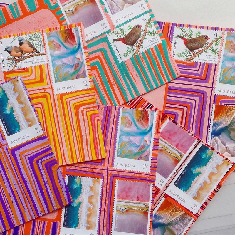
Every new letter, for me, is an opportunity to combine—loosely or inextricably—visual elements and the written word: an idea explored in at least two ways. It’s enclosed in an envelope (that can also be a work of art) that bears the recipient’s name and address. Add to this the official postage stamps and cancellation marks of the Post Office—marks of documentation—and the letter is historically positioned, an artifact in Place and in Time.
Finally, I love that letter writing also encompasses interaction with others. Each letter is, from the moment of its creation, intended for somebody…it’s delivered by people (I often wonder about the anonymous couriers who deliver my letters) to other people. It’s a message, as well as a work of art, and its audience is woven into its making, from the start.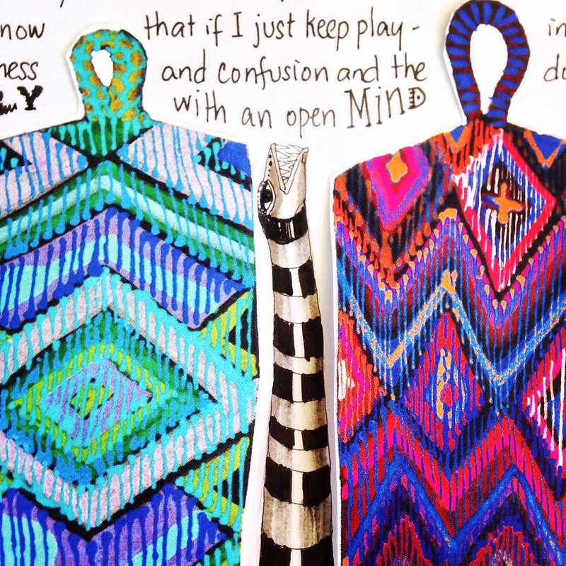
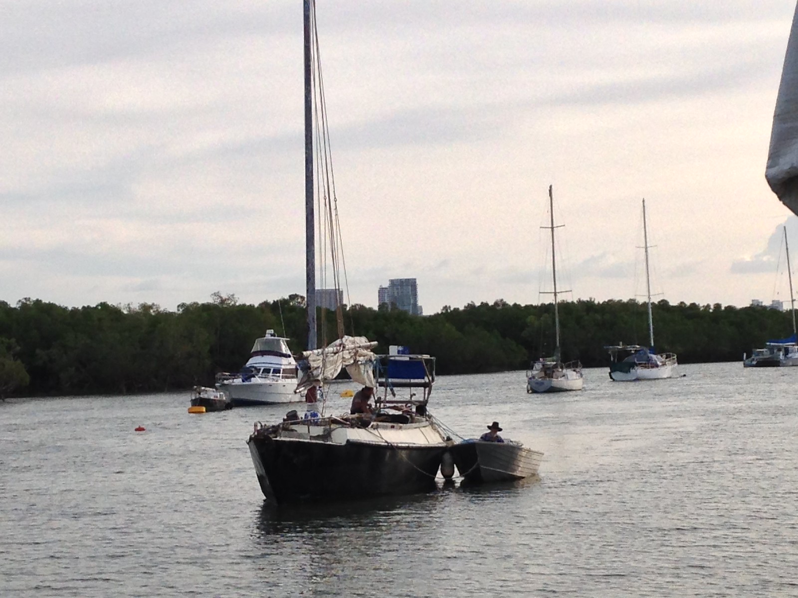
I tend to produce art in a kind of vacuum or cave, filled with echoes of my own voice. I spend four days each week confined to a houseboat in the mangroves, gazing into my head instead of out of it, painting and writing things that I often don’t know what to do with, when they’re done. Naturally, I hope that each work will find its way out into the world, though a lot of them never do…they wind up wrapped in tissue at the bottom of a cardboard box.
Since I started making these letters, though, others figure much more in what I do. I write and paint with specific people in mind…knowing, even as I work alone, that the thing I am making is awaited, expected, and appreciated.
AND it never gets boring! Which is MAGIC! Possibly the best thing about the whole project! Every month is an opportunity to try something new, to experiment with all these elements, to take them apart and recombine them without worrying that I’m producing a dog’s breakfast of crazy, disparate works, because the letter’s very distinct form pulls them all into a coherent whole.
It really is the perfect medium. I’ve found my “Next thing”! I can’t get over it. I can’t believe it took me so long to recognise this.
“And I said, with rapture,
here is something I can study all my life,
and never understand.”
—Samuel Beckett, Moloy
Illustrated Letters
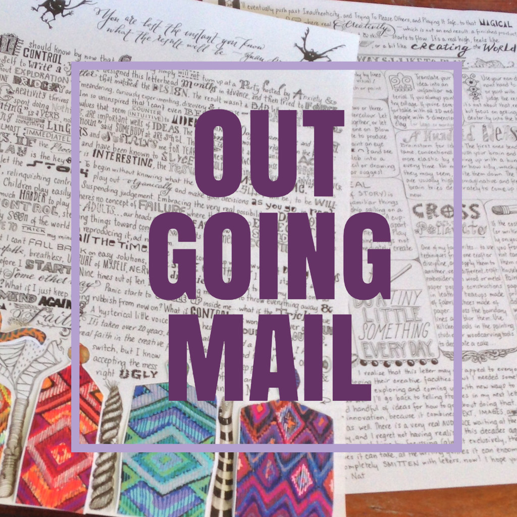
 As my letter subscription project crosses the half-year line and hits 50 subscribers, I’ve been inspired to go deeper into what a letter can be by exploring the different kinds of art, of writing, and interactive possibilities that can be included in this versatile, remarkable form of self-expression.
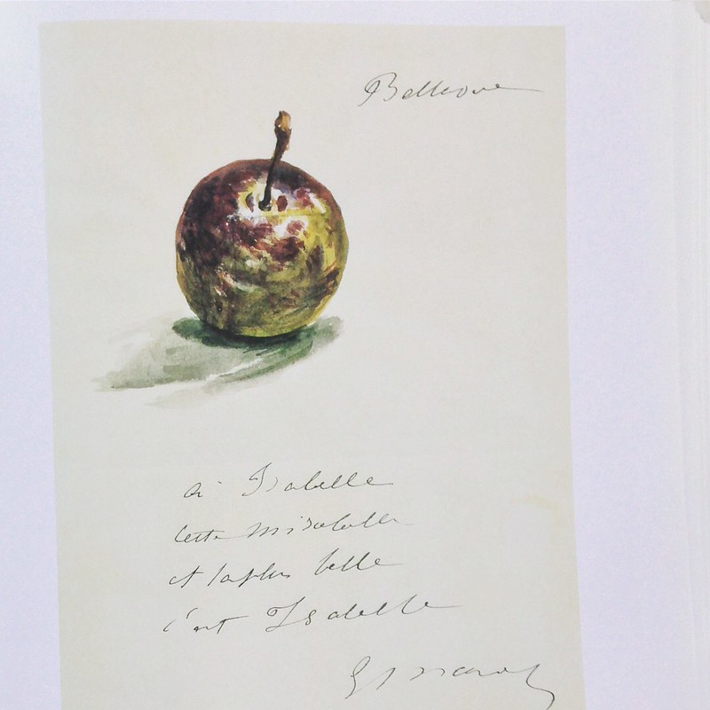
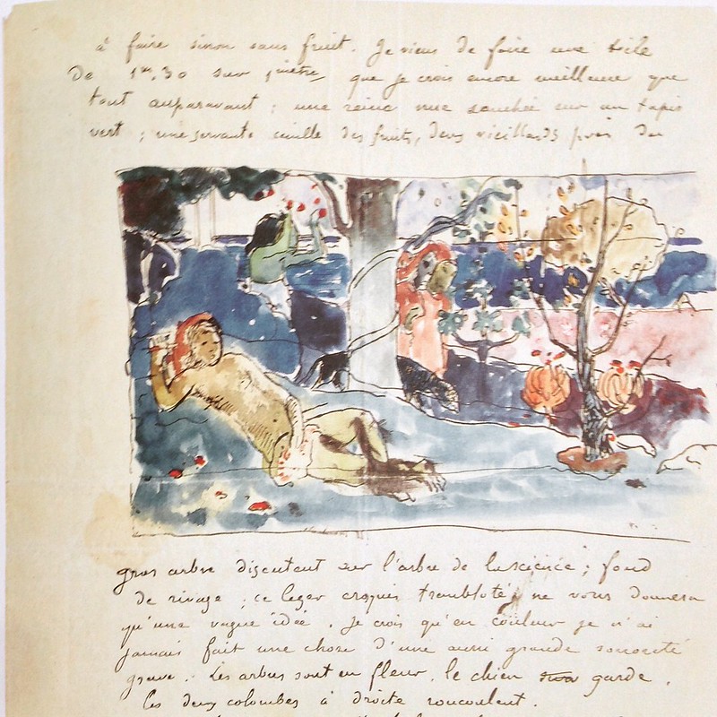
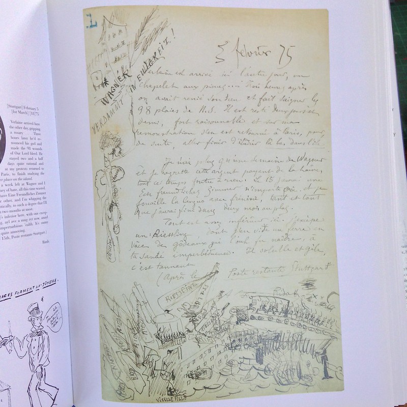
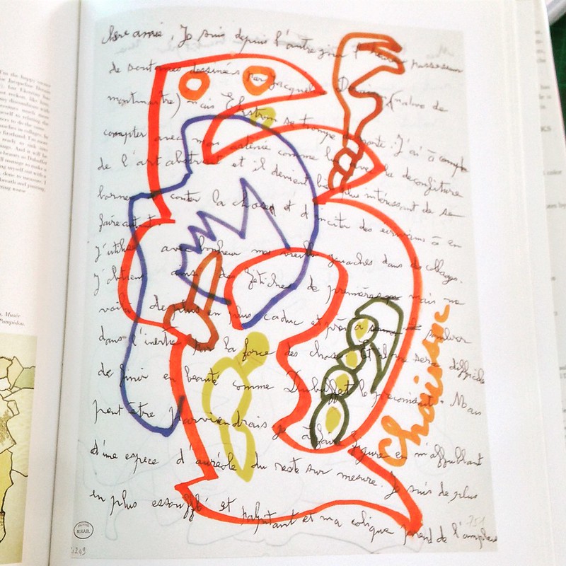
Gradually, more books about letters are finding their way into my personal library. Inspired this week by Illustrated Letters: Artists and Writers Correspond, a collection curated by Roselyne de Ayala and Jean-Pierre Guéno.
Taken entirely from French sources, there are letters by Gaston Chaissac
Georges Hugnet…
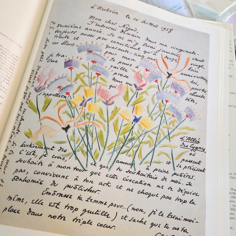
Edouard Manet…
Paul Gauguin…
Arthur Rimbaud (swoon!)…
And this heart-stopping beauty by Victor Hugo…
…as well as letters by Picasso, Corbusier, Van Gogh, Turgenev…so many brilliant artists and writers. They’re just scrumptious! If I ever received a letter like Hugo’s, I think I would eat it…
An unexpected gig
 So here’s a little story that I forgot to say anything about, back in April when it happened…
The phone rang at work, one afternoon, and a lady asked me if we (Jackson’s Drawing Supplies, an art materials shop) knew anybody who would do some calligraphy in a hurry. It’s been a long time since any calligrapher left a business card with us, so I told her “Sorry, no active calligraphers that we know of…except maybe…”
“Except?”
I assumed it was for a wedding, and that she wanted someone to address the envelopes in a curly copperplate-style script. I can do that, surely, I’ve been writing envelopes all month…
“Well, I sort of do it…only…I don’t know whether my work is good enough…I’ve never done it for a client before, you see…”
“Please send me a sample of your calligraphy work today.”
What? Today? I took a photo of some amateurish sign I’d made for the shop’s calligraphy section (“Clearance Sale— Calligraphy Nibs”), added a nicer shot of outgoing Scarlet Letterbox envelopes I’d written in gold on black, and e-mailed them to her.
“We would love for you to do the job for us,” she wrote back the next day. And so they sent me the project specifications.
“What the F*(#”
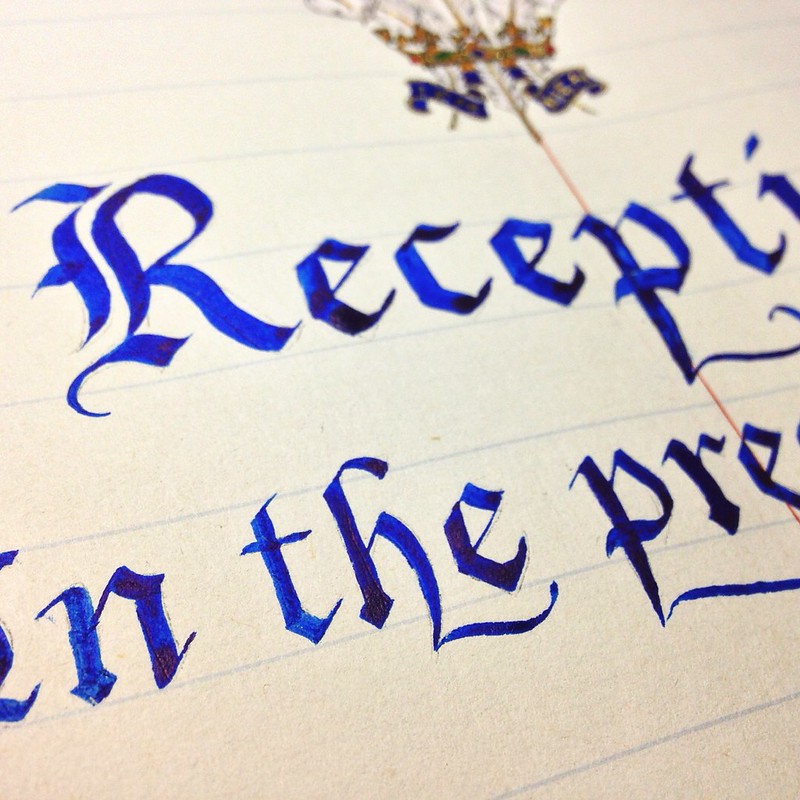
It turned out that I’d been speaking to a representative of Darwin’s Government House—a historical building in the city—and that the gig was a page in their huge visitor’s book, to commemorate a visit from Prince Charles in less than two weeks’ time. The lettering wasn’t in copperplate at all…they wanted Gothic blackletter, or at least batarde. I would have to learn to write an entirely new lettering style. Nothing could stand more opposite to the swashy “cupcake shop” script I had been practicing. Also, they wanted an heraldic badge, the Prince of Wales’ feathers, at the top…in colours and gold. One page had been marked in the book…I would have just one shot at it, and there were less than 10 days to do it.
Holy ostrich feathers, Batman, what had I gotten myself into? When I told friends, via facebook, what I had been asked to do, most made very strange comments like “Congrats! They picked the best person for the job,” or “They should be honored that you have consented to do the art work.”
I reeled in confusion…who were these glib and cheering people that seemed to know me so very little, after all these years? Only Helen grasped the utter weirdness of a job like this winding up in the reluctant, sweaty palms of a royalty–oblivious troglodyte like me, and she alone said something I could actually relate to:

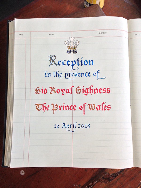 The story ends happily. I managed the heraldic badge admirably (I think so, anyway), and although the letters are a bit ho-hum—no virtuoso gothic writer, me—they are readable, and clean, and centered.
I only spent 19 hours agonising over this simple page—most calligraphers would have dashed it off between breakfast and tea time—but it was delivered on schedule, in one piece, and Bonny Prince Charlie signed the recto page…probably without glancing at my verso page, because the poor man only has to appear at dreary official engagements—ribbon cutting, guestbook signing, niceties-mumbling, tea slurping and biscuit nibbling—about 12 times a week (he is described as “the hardest-working member of the royal family”) and he’s actually a deeply intelligent and compassionate person with serious philanthropic, philosophical and environmental interests, so that it really seems he had the tougher gig between the two of us, and who can blame him for being blind to visitor’s books?
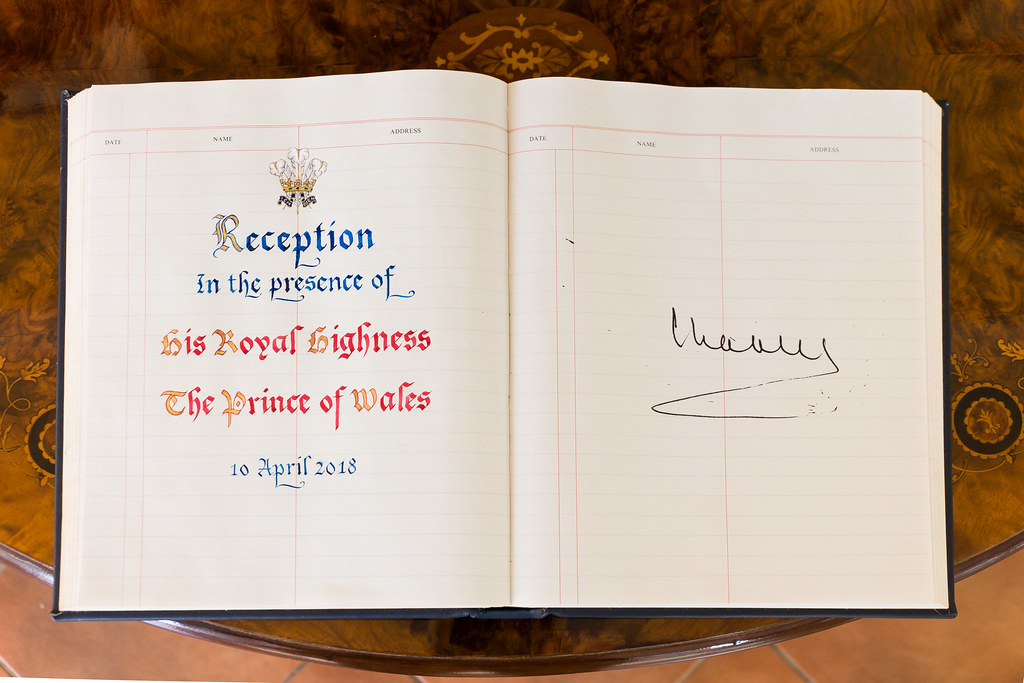 The ladies of Government House very kindly sent me photos of the signed guest book, afterwards. This is the closest I will ever be to royalty…but a hand’s breadth between my writing and his, is pretty close.
I was more deeply honoured by this incongruous juxtaposition of our scribbles than I let on because, while I don’t give a rat’s ass about the titles one inherits at birth from one’s forebears, I respect the man: the way he has chosen to spend his time on earth, the efforts he has made to understand the issues, to help others, perform his duties, and still be himself. He cops a lot of flak for some of these things, but any person who believes passionately in anything, and does something about his convictions, will have critics, no?
Except that I am still waiting to be paid for this job that I did in early April; but I rang my clients yesterday and they seemed surprised to hear that I haven’t received my fees, so maybe something will happen.
Any day now.
Any.
Day.
Now.
shoals of Caribbean fish
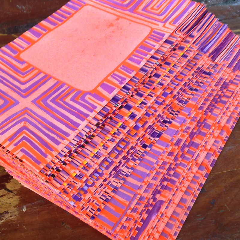
Here’s what I did on the boat, the day we ran away from our house-sit. I had 40+ envelopes to decorate and address…preferably without hand-painting each one (I did this for the last batch of letters…printed the ship, but then painted different colours into each one. It took daaaaays! I had no other life!)
I didn’t have any ideas ready…just the theme of the letter, which is about (among other things) learning how they cook fish in Guyana, South America.
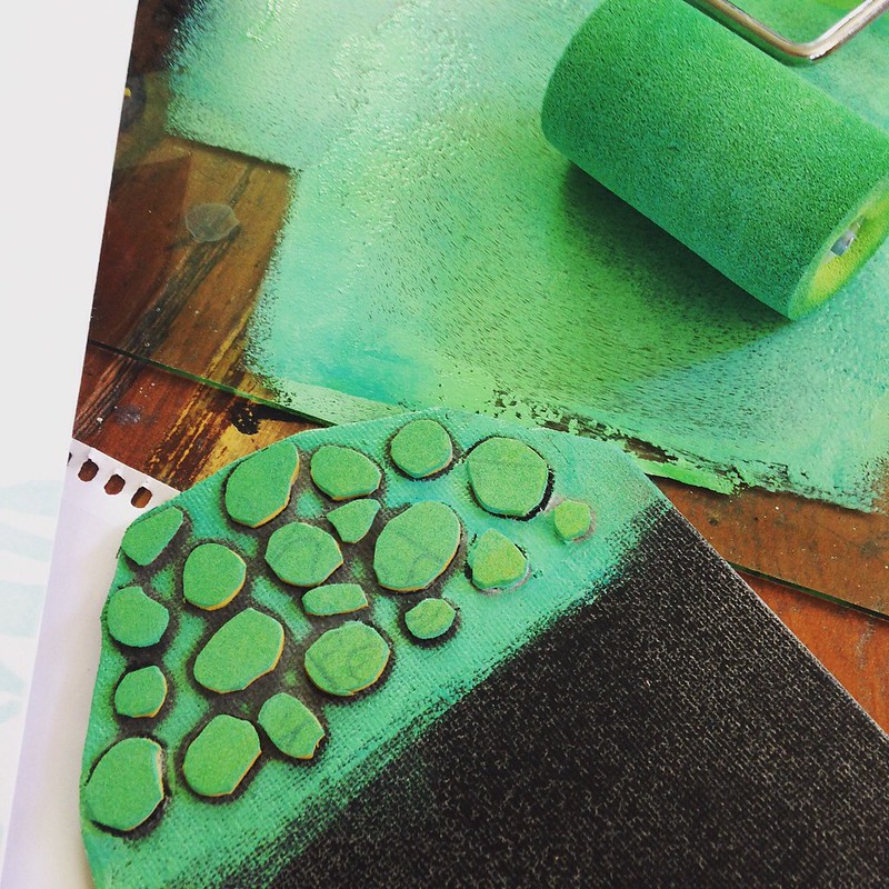 I took a piece of craft foam and (with scissors) roughly cut out a shape like coral with wavy tendrils. Sprayed some adhesive onto the back of the foam, stuck it down to a piece of cardboard box (it can’t be washed…it doesn’t have to last, I just need it to print these envelopes!) Rolled out a very pale aquamarine acrylic paint, using a foam roller (foam is much better than a printmaker’s rubber brayer, for acrylics.) See “DIY craft foam stamps” for more information…
Using more foam, I cut out the little circles you see here, glued them down to a damaged canvas board (postcard sized) and printed in a stronger sea green.
It needed something sharp and contrast-ey, so I carved a fish in white rubber (like eraser rubber, but you can get it in thick tiles.) I used a rubber brayer to print, and oil paint (to which I added drops of alkyd medium…speeds up the drying of oil paints).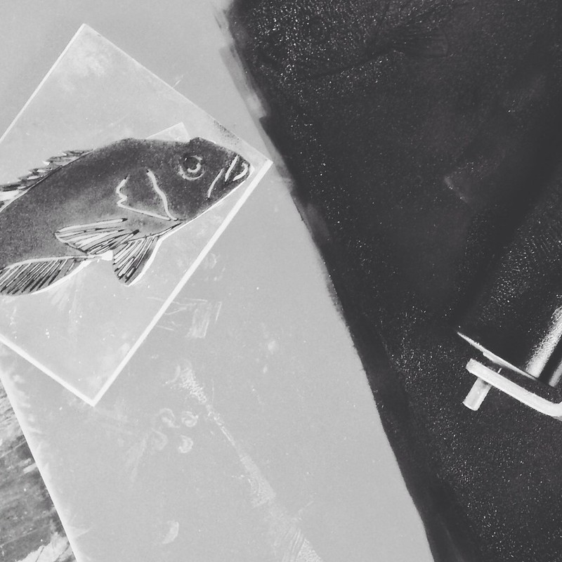
¦¦¦¦¦¦¦
You start to print, and a rhythm sets in…roll, press, lay aside to dry, roll, press…each print is similar to the others, but slightly different. I delight in the nuances in color, picking up more blue with the roller at times, and then more shamrock green…
I was a terrible student in printmaking class, where the goal was to produce editions of identical prints (we did collagraphs, zinc plate etching, silkscreen and reduction lino) and I flat out rejected the very idea of editions…I wanted to see what my design looked like in different colours. I moved plates around to change the registration. I altered plates after every print. Everything I made was a monotype, one-off and impossible to repeat…I mean, why wouldn’t you want this? It’s awesome! One plate, 50 different prints made from it! Good times.
My instructor gave up on me in the printroom (though he and I continued to drink beer together after class.)
¦¦¦¦¦¦¦
At first I printed with phthalo turquoise…too transparent, and still not enough contrast. So I added burnt umber. The texture of the envelopes (Crown Mill envelopes from Belgium…how very ooh la la!) looked like ripples of sunlight underwater, and sometimes resembled scales. More interesting.
The fish swam up and down…trying to find the best position in the coral, but bearing in mind that it had to leave space for postage stamps and addresses. 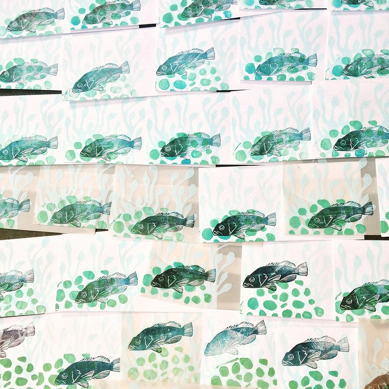
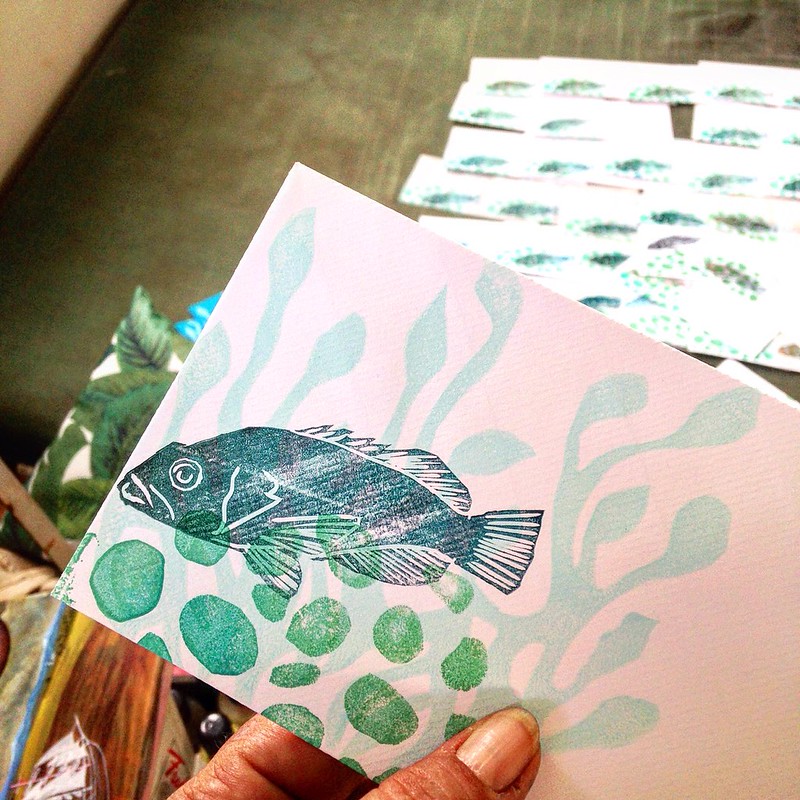
I went on to add the stamps and addresses, next…
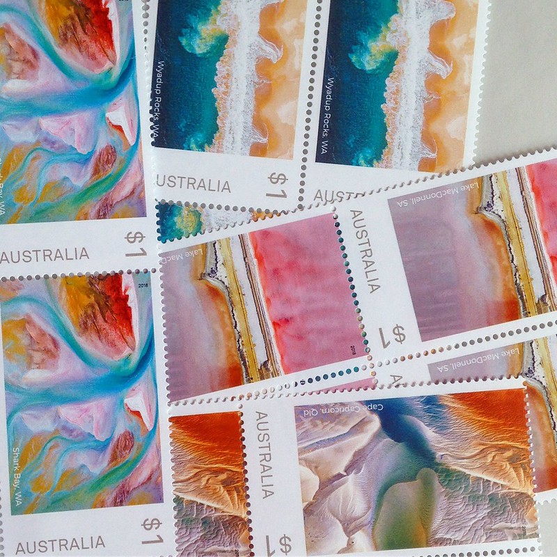
Note to self: get one of those sponge thingies for wetting postage stamps… licking 80-100 stamps in a day is weird. Like stamp gum has become one of the main food groups, making up a hefty percentage of one’s recommended daily allowance of cellulose or who-knows-what. The stamps from the 80’s were a little bit sweet (so thoughtful of the post office, then, no?) Most just tasted like old paper.
Launched: The Haitian Armada
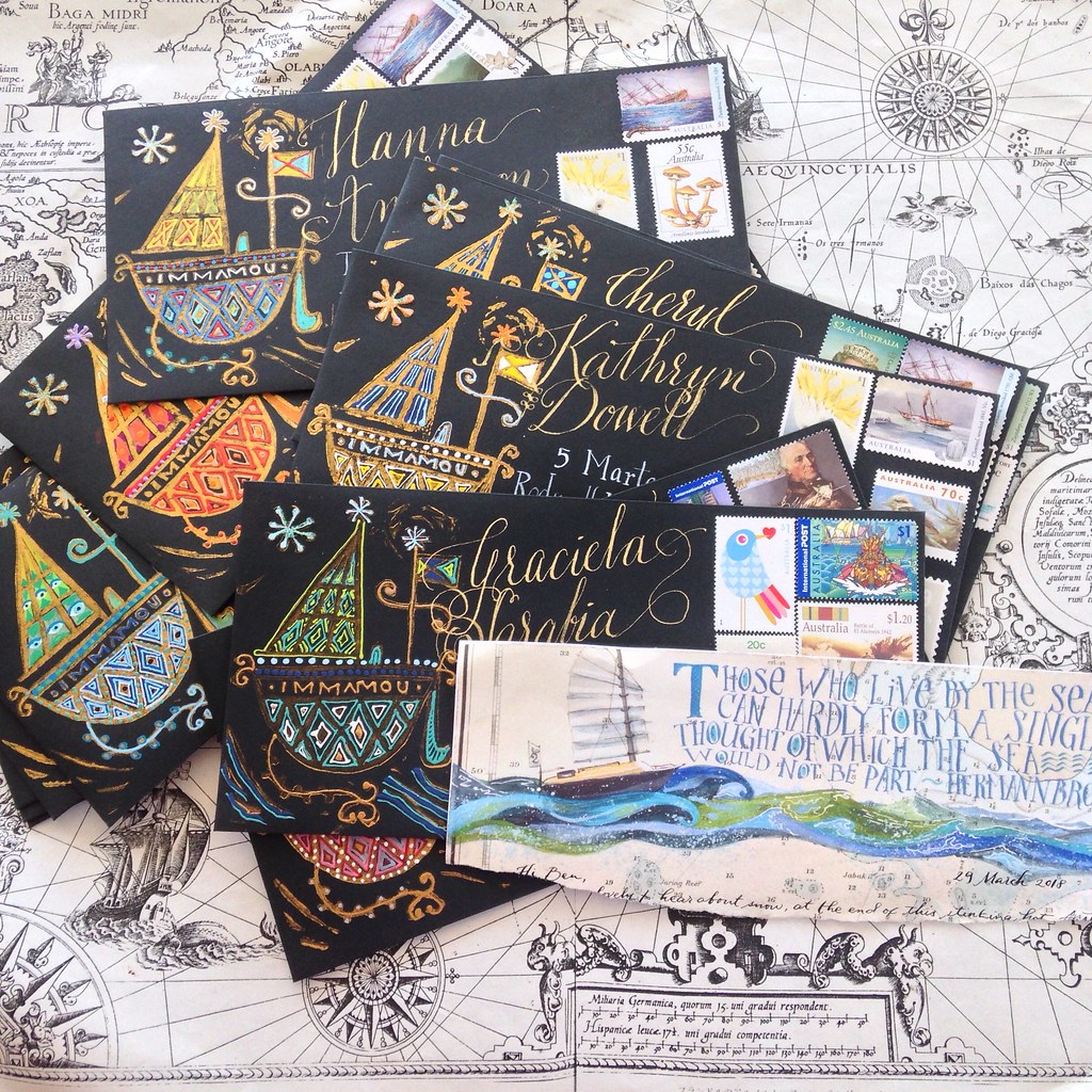
At last! Some outgoing mail! This is hopelessly late, thanks in part to a cyclone, but also because…guess who’s back in Australia?! So happy, and so busy, catching up on the 16 months we were apart, that I haven’t been able to do anything else!
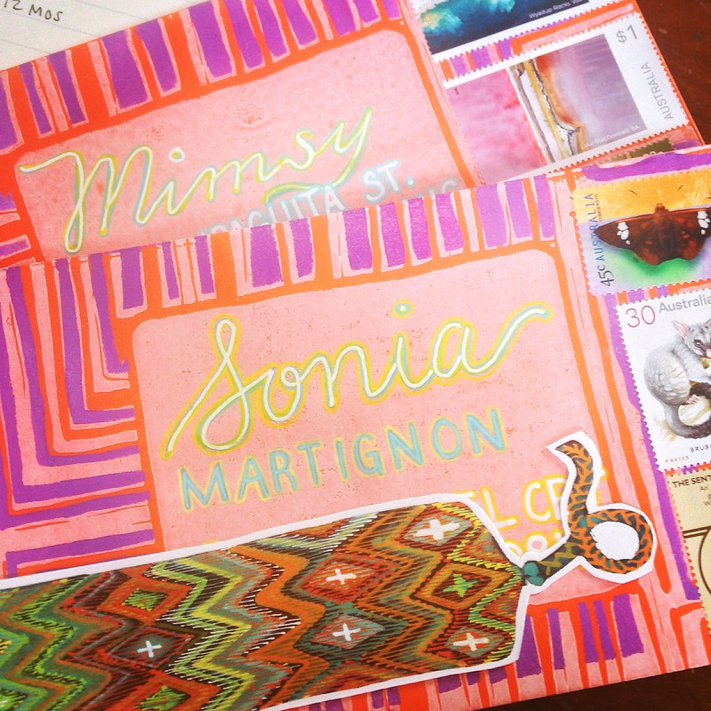
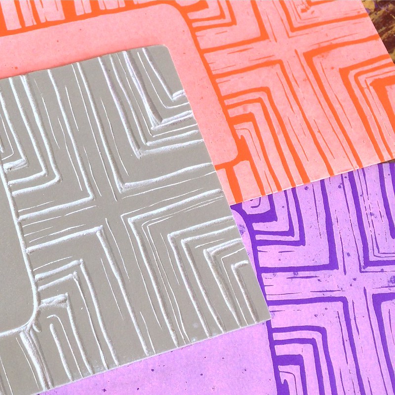
A letter about a year on an island, and living by the sea. The Haitian vevé of a ship, rubber linoprint with hand colouring, gold and white inks, artistamps, and a wax seal (not shown…coming on the reverse, when I seal these babies up) adorn the envelopes.
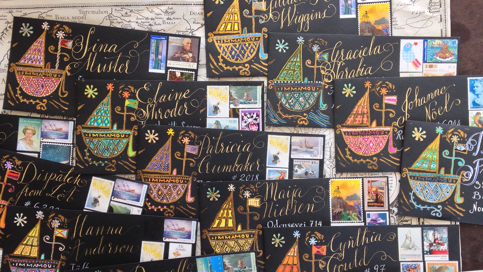
You can still start your subscription to my monthly letters of art, calligraphy, postal porn, and stories, with this one…please visit my Etsy shop for more details.

