Here’s what I did on the boat, the day we ran away from our house-sit. I had 40+ envelopes to decorate and address…preferably without hand-painting each one (I did this for the last batch of letters…printed the ship, but then painted different colours into each one. It took daaaaays! I had no other life!)
I didn’t have any ideas ready…just the theme of the letter, which is about (among other things) learning how they cook fish in Guyana, South America.
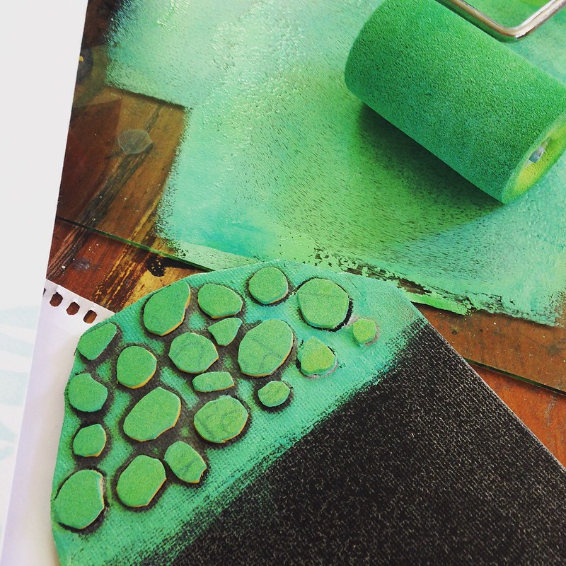 I took a piece of craft foam and (with scissors) roughly cut out a shape like coral with wavy tendrils. Sprayed some adhesive onto the back of the foam, stuck it down to a piece of cardboard box (it can’t be washed…it doesn’t have to last, I just need it to print these envelopes!) Rolled out a very pale aquamarine acrylic paint, using a foam roller (foam is much better than a printmaker’s rubber brayer, for acrylics.) See “DIY craft foam stamps” for more information…
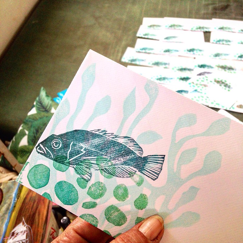
Using more foam, I cut out the little circles you see here, glued them down to a damaged canvas board (postcard sized) and printed in a stronger sea green.
It needed something sharp and contrast-ey, so I carved a fish in white rubber (like eraser rubber, but you can get it in thick tiles.) I used a rubber brayer to print, and oil paint (to which I added drops of alkyd medium…speeds up the drying of oil paints).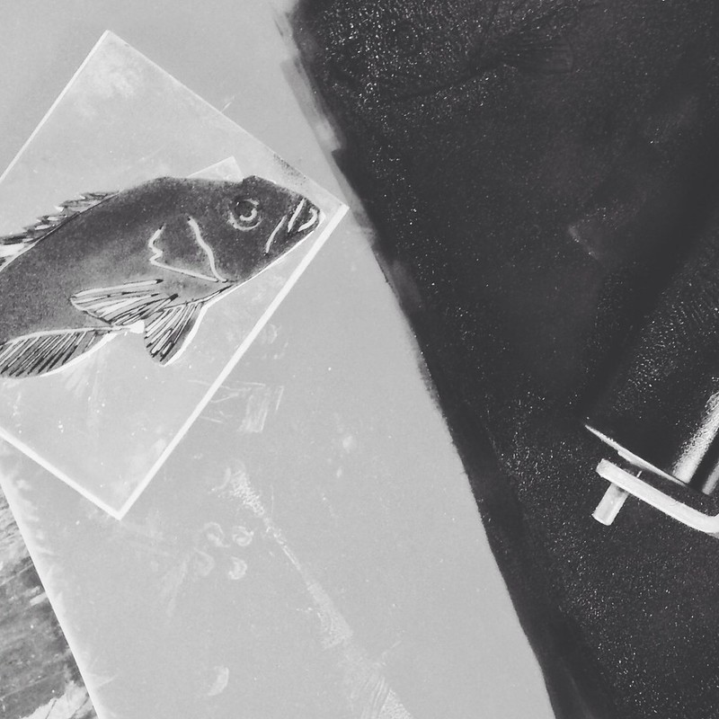
¦¦¦¦¦¦¦
You start to print, and a rhythm sets in…roll, press, lay aside to dry, roll, press…each print is similar to the others, but slightly different. I delight in the nuances in color, picking up more blue with the roller at times, and then more shamrock green…
I was a terrible student in printmaking class, where the goal was to produce editions of identical prints (we did collagraphs, zinc plate etching, silkscreen and reduction lino) and I flat out rejected the very idea of editions…I wanted to see what my design looked like in different colours. I moved plates around to change the registration. I altered plates after every print. Everything I made was a monotype, one-off and impossible to repeat…I mean, why wouldn’t you want this? It’s awesome! One plate, 50 different prints made from it! Good times.
My instructor gave up on me in the printroom (though he and I continued to drink beer together after class.)
¦¦¦¦¦¦¦
At first I printed with phthalo turquoise…too transparent, and still not enough contrast. So I added burnt umber. The texture of the envelopes (Crown Mill envelopes from Belgium…how very ooh la la!) looked like ripples of sunlight underwater, and sometimes resembled scales. More interesting.
The fish swam up and down…trying to find the best position in the coral, but bearing in mind that it had to leave space for postage stamps and addresses. 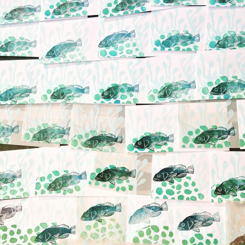
I went on to add the stamps and addresses, next…
Note to self: get one of those sponge thingies for wetting postage stamps… licking 80-100 stamps in a day is weird. Like stamp gum has become one of the main food groups, making up a hefty percentage of one’s recommended daily allowance of cellulose or who-knows-what. The stamps from the 80’s were a little bit sweet (so thoughtful of the post office, then, no?) Most just tasted like old paper.